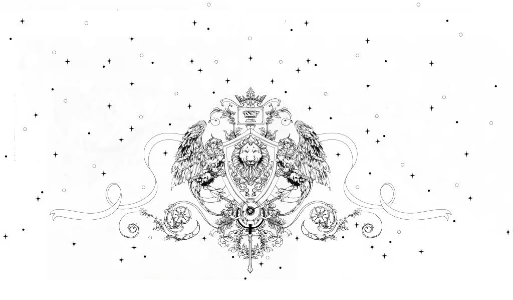
Updating with a cleaned up version of a drawing from an earlier post. Needs better editing, and re-doing the ribbon with vectors was a bad idea. But overall pretty satisfied.
cool. i think if you stroke the ribbon vector w a painterly brush or calligraphy pen stroke - the varied line weight& or texture could make the ribbon look ok.

1 comment:
cool.
i think if you stroke the ribbon vector w a painterly brush or calligraphy pen stroke - the varied line weight& or texture could make the ribbon look ok.
i dono -
haha.
Post a Comment